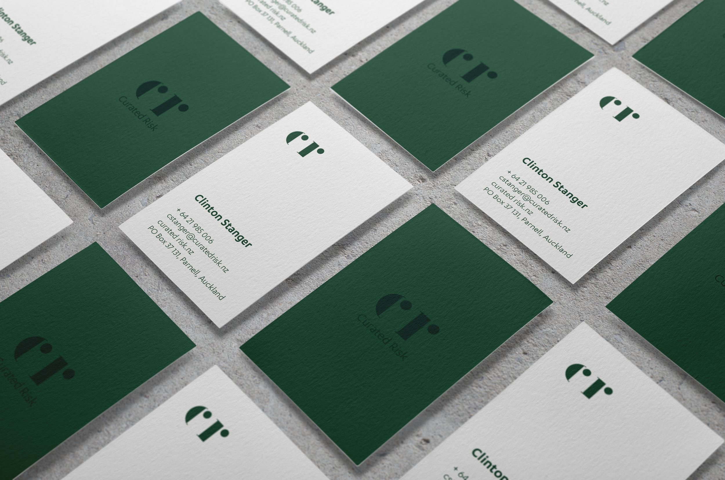
Curated Risk
This visual identity presents graphics which manipulate expected forms to invite the eye to take a second look. Colour was carefully considered, with a desire to steer away from the industry norms. Green - in particular deep, rich tones - symbolises growth, harmony, freshness and has a strong emotional connection with safety. The print suite included business cards, postcards, labels, letterhead and website.
Visual identity / Print design / Copywriting / Website: curatedrisk.nz